Mojo Monday 354 (on a Wednesday), and a hard color challenge

Standard

I have been stewing over the Paper Players color challenge for several days.  It’s like my brain just shut down when I tried to envision using those four colors together.  Then we got the very sad news that a couple we knew at church had lost their 9 year old grandson (and the grandson’s other grandfather) in a private plane crash.  Sympathy cards are hard enough to make, but when it’s for a child, it is just so sad.  I decided that I would use that color combo in my card, and also use the Mojo Monday sketch.

The hardest color for me to incorporate was lost lagoon!  (do you see that tiny layer of wisteria wonder under the strip of blackberry bliss!  it’s easy to miss!) I finally decided to use it to outline the image.  And can I just say that after coloring with the blendabilities, I am totally spoiled.  It was so boring to use plain old blender pens!  I had to use all kinds of different adhesives on this card because of all the layers!  I used tombow multi glue on the embossed piece and the thin strip of mossy meadow.  I also used sticky strip to attach the greeting to the thin strip of mossy meadow.  I had to use bits of dimentionals on the right sides of the sentiment and the main image because the other layers were so high.  The only thing I left off of the sketch was a bow.  It just didn’t seem right for a sympathy card.

I really like this sketch, and I can see myself using it again.  I can’t say the same about the color combo, lol, but it really made me think outside the box to “get ‘r done”!

012

Stamps:  Bloom with Hope

Paper:  Park Lane DSP, Mossy Meadow, Blackberry Bliss, Wisteria Wonder, Whisper White

Ink:  Memento Tuxedo Black, Mossy Meadow, Blackberry Bliss, Lost Lagoon

Misc:  Circle thinlits, Swiss dots embossing folder, scallop oval punch, large oval punch

The need for this card reminds me how life can change in the blink of an eye.  Let’s love and appreciate our family and friends because you just never know when you won’t be able to do that anymore.

{{{hugs}}}

Sharon


I Like You/FMS144

Standard

Whew–so sorry about not posting for several days!  We drove to Illinois Friday to visit my parents and brother/his family.  We had such a good time eating, talking, laughing, playing “Phase Ten” and crafting.  My sister in law is one of the most talented crafters I know.  She has an open house around the holidays to sell all the wonderful Christmas crafts that she makes, but I am too far away to go, so she let me browse through her inventory this weekend, and I came home with a bag full of great new decorations.  Her latest project was teaching groups of women to make patriotic mesh wreaths, and she showed me how to make one, so I also have an amazing wreath!  Even though it is after July 4th, I am going to display it until Labor Day!  It’s too pretty to pack away just yet.  We drove back home Sunday after going to church and out to lunch with my parents, so it was a quick trip.  Tiring, but worth it!

My Mom was the first person to introduce me to StampinUp, and she had just gotten the envelope punch board, so we had a great time learning how to use it (thank goodness for youtube!).  I showed her how to find ideas on pinterest, and set her up with her own board.  Her life will never be the same, haha!

I wanted to play with some of my new goodies that came in my order last week, and I also felt like coloring, so I chose an image from the hostess set “I Like You”.  I liked the Freshly Made Sketch for this week, so I used that design along with some of the yummy Sweet Taffy DSP (LOVE the bright colors!).  I colored pearls with my blendies to use in the center of the flowers and tied on a piece of the stitched satin ribbon (it is smooth as butter–love, love, love  it!).

After putting everything on my card base, I didn’t have a whole lot of room for a sentiment-oops!-so I chose one from the “Good Greetings” set that I earned last month (yay, me!) and masked off one of the words with scotch tape before inking it up and stamping it.  I didn’t want to mat it, because I wanted to keep it small, so I sponged it with tempting turquoise to make it stand out better.

011

Stamps:   Good Greetings, I Like You

Ink:  Tempting Turquoise, Memento Tuxedo Black, Blendies

Paper:  Sweet Taffy DSP, Tempting Turquoise, Daffodil Delight

Misc:  woodgrain embossing folder, word window punch, pearls, hello honey stitched satin ribbon, circle framelit


{{{hugs}}}

Sharon


PPA #211

Standard

My box of new goodies arrived yesterday, and I was so excited to unpack it.  FOUR packs of DSP!!  Now, I have a ton of DSP because I am such a horder, but I’ve never had this much current DSP!  I had to open each pack and pet it a little bit, lol!  I also got new stamps to play with, and I chose #Hello for this challenge.

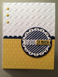
I just love the combination of bright yellow and deep, dark blue!  SO pretty.  When I envisioned this card, I thought sure that I had the Stylish Striped embossing folder, but sadly I did not, so I used the chevron folder and turned it around to try to get the effect I was looking for.  I’m not sure if it worked the way I wanted–and it sure made placing the candy dots a little tricky!

See how I popped up part of the sentiment?  I’ve seen others use their punches like this, but I hadn’t tried it yet.  It’s awesome!  Just punch one side of your sentiment, then stick one end of the piece to a sticky note and punch out the other side.

When I was embellishing the scallops, I was SO wishing that I had gotten the NON blendies.  How pretty would it look with tiny pearls colored with the darkest color!  If only I could get everything all at once, haha!  *sigh*

Anyway, it was a lot of fun to make this card!  Hope ya’ll like it!

005

Stamps:  #Hello

Paper:  Night of Navy, Whisper White, Flowerpot DSP

Ink:  Night of Navy

Misc:  chevron embossing folder, word window punch, scallop edge border punch, brights candy dots, rhinestones


{{{hugs}}}

Sharon

CAS Sympathy Card

Standard

I was sad to hear that a member of our stamping group passed away this week after a battle with cancer, and I wanted to make a card to send to her family.  I like to use Thoughts and Prayers for sympathy cards-the images and sentiments are classic.  Although I didn’t come up with this layout on my own, it is one that I use over and over.  It works so beautifully with this set!  I chose vanilla paper because it softens the images.  I did try to make this with basic black ink, but I had trouble getting a good solid image, and then the image smeared-ugh!-so I reached for my now favorite Memento black pad.  Love it!  The picture doesn’t do the final card justice–it looks very nice in real life.

003


Stamps:  Thoughts and Prayers

Paper:  Very Vanilla

Ink:  Memento black, Pumpkin Pie, So Saffron

Misc:  sponges, squares framelits


{{{hugs}}}

Sharon

Fun with Vivid Vases

Standard

Remember yesterday, when I said that all I wanted to do was take a nap?  Well–a stomach bug has invaded our house!  It got my daughter yesterday, my husband in the middle of the night, and me this morning!  No church for us today!  Thankfully I had made chicken noodle soup yesterday for my daughter, so we will have that for supper tonight and surely we will all feel better tomorrow!

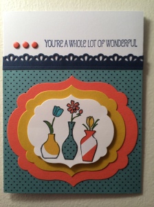
I did feel good enough to play a little bit in my stamp room!  I put all the tabs in my personal catty and made sure that I had marked everything that I have (only found one thing that I have doubles of–not bad!), and then chose Vivid Vases to use for my card.  I have seen a lot of people cut the sentiment off, and I figured that I would get a lot more use out of it that way, so I took a deep breath and chopped away!  I went back to my Flower Pot DSP (I can’t wait for my next order to get here so I can play with some different papers–hello buy 3 packs get 1 free!!!  Whoo hoo!) and after choosing the colors and putting everything together I realized it looks a lot like the popular colors of the 70’s–gold and orange appliances, carpet, etc!  I just needed a nice green in there to complete the look–eeks!  Thankfully there was Night of Navy available to tone it down a little bit.

I had fun doing some paper piecing on the vases, and I masked off 2 of them because I wanted a smaller image.  I finished everything off with some candy dots (LOVE them!) and a rhinestone in the middle of one of the flowers.

It was a fun card to make, and I used colors that I don’t normally choose.  Hope ya’ll like it, too!

001


Stamps:  Vivid Vases

Paper:  Flower Pot DSP, Crushed Curry, Tangerine Tango, NIght of Navy, Whisper White

Ink:  Memento, Night of Navy, markers

Misc:  Labels Collection framelits, Finishing Touches edgelits, brights candy dots, rhinestones


{{{hugs}}}

Sharon


Sunburst Card

Standard

Happy Saturday!  Today I am feeling very lazy.  It is a beautiful breezy day, and normally I would be out playing in the dirt, but all I want to do is take a nap!  It has been a good while since we got any rain, so I did go outside and water my flowers.  Look at this freaky guy who was waiting for me out on the front porch (*shudder* I HATE spiders!):

003

I did want to make a card, tho, and I figured a sunburst card would be easy and fun to make.  I went back to my favorite DSP–the Moonlight stack–and chose four designs that looked good together.  I THOUGHT I remembered how to make this card, so I merrily started cutting the strips.  Well–let me tell you, if you are not paying attention, this is NOT a fun and easy card to make!  After trying several times to line up my strips, I decided to head to you tube to watch some videos and try to figure out what I was doing wrong!

Here is my tip: make sure to start at the lower left corner of your strips of DSP when cutting them in half!  It works great when you do that!

004

Stamps: Just Sayin’

Paper:  Moonlight DSP stack, Blackberry Bliss, Whisper White

Ink:  Blackberry Bliss

Misc:  Labels Collection framelits, Word Bubbles framelits, White Organza ribbon


Hope everyone is having a great weekend!


{{{hugs}}}

Sharon


Bloom with Hope-my favorite hostess set!

Standard

Tonight I wanted to use my blendabilities–aka “blendies”–and play a little more with the pretty Park Lane papers.  The large flower stamp in the Bloom with Hope set was the perfect image to use for this card.  It is so much fun to use the alcohol markers–I continue to be amazed at the shading that emerges after it dries!  Makes me feel almost like a painter, lol!

I don’t normally use this size card base, but it worked well for this design.  It’s been awhile since I rounded any corners, too!  I really wanted the sentiment to look like it was on a leaf, but when I did that, it just didn’t seem right.  I played around with it–tried it in the lower left corner first with no layering, then tried it backed with the curly label punch (cut in half), but it still wasn’t looking good, so I added the modern label punch to the layer, and finally liked that.   I LOVE the soft colors together!   I meant to add some pearls to the upper left corner, but I got distracted by a bowl of ice cream calling my name, hahaha!

001

Stamps:  Bloom with Hope

Ink:  Soft Suede, Memento Black, Daffodil Delight Blendabilities

Paper:  Park Lane DSP, Soft Suede, Whisper White

Misc.:  Woodgrain Embossing Folder, Large oval punch, Modern Label punch, Curly Label punch, corner rounder punch, Organza ribbon, dimentionals

I’m so glad that I’m off work tomorrow–I’m looking forward to sleeping past 4am, and then spending some time with friends and my hubby.  I’m hoping to get some extended time in “My Happy Place”, too (my stamping room!).   Hoping all of you have a wonderful, relaxing day!

{{{hugs}}}

Sharon


Top Note Flag Box

Standard

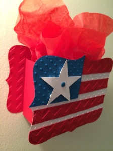
I love the Big Shot, and I was SO excited when I finally got one for myself!  The first die I ordered was the Top Note Die, and it is still one of my favorite dies to use.  I made this box a couple of years ago when I was a customer, at Judi Sparks’ class (go visit her blog-Judi’s Cuties-she is very talented!) and I fell in love with it!  We didn’t have all the embossing folders at the time, so I remade it today using the dots and chevron folders.  I also don’t have the stars framelits, so I had to use a retired star punch.  I think it would be super cute with several different sizes of stars, tho!

We don’t have a box die, so I made a box using a strip of real red cardstock, cut at 11″  x 4 1/2″.   On the 4 1/2″ side, score at 1 1/2″.  On the 11″ side, score at 3″, 5 1/4″, 8 1/4″ and 10 1/2″.  Cut off the strip that measures 1 1/2″ x 1/2″.  Cut the other score lines on the 1 1/2″ side up to the score line.  Fold into a box shape and secure with red sticky strip, tombow multi glue or the new fast fuse adhesive–if you use SNAIL, your box will fall apart–trust me when I tell you this!

006 005


Looks like I got a little overzealous with the dimentionals on my star, lol!  Love those things!


{{{hugs}}}

Sharon

A Round Array

Standard

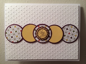
It’s one of my goals to actually USE everything that I have, so tonight I pulled out A Round Array and stared at it for awhile, trying to figure out just how to use those tiny images on a card.  I knew I wanted to use some more of the pretty Park Lane papers, and even though all white backgrounds intimidate me, I thought that it would look best with the designs I chose, so I got to work!  It looks like a pretty simple card–and it is–but there are a LOT of layers!  I popped up the dotted piece with dimentionals, and I also used dimentionals on the central image to try to make it look a little bigger.   Now that I am looking at the picture of it, I’m wondering if I should have used another layer of hello honey under the first white layer to balance out those honey colored circles?  Or is that overthinking it?  Anyway, here it is:

001


Stamps:  A Round Array

Paper:  Blackberry Bliss, Whisper White, Park Lane DSP

Misc:  Circle punches ( 1 3/8″, 1 1/4″, 1″),  7/8″ scallop punch, swiss dots embossing folder, dimentionals


I just wanted to share something funny that happened today.  First, a little background–I have to get up very early because I leave for work at 5am.  I do have a routine that I follow, and the very last thing I do before I go out the door is put on my shoes.  Well, lately I have started wearing nice, squishy flip flops around the house because my feet hurt if I go barefoot.  Apparently I was pretty distracted, or sleepy this morning because I left the house still wearing my flip flops–and didn’t realize it until too late to turn around!  I ended up covering the flip flops with surgical shoe covers for the day.  It was ridiculously, awesomely funny–my coworkers and I all got a good laugh out of it!

{{{hugs}}}

Sharon

Six Sided Sampler

Standard

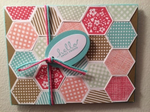
Today I was looking through my stamps, trying to find something to inspire me, and I realized that it has been quite awhile since I have used the ’13-’15 in colors.  AND–I had unopened spools of thick bakers twine calling my name, too!   The poor babies were feeling neglected, what with all the new, exciting stuff that has come out!  I wanted to use all of the colors so that’s why I chose the Six Sided Sampler stamp set.  While I was stamping, I was thinking about the names of the colors–Baked Brown Sugar, Strawberry Slush, Pistachio Pudding–doesn’t it just make you want to stuff something sweet in your mouth when you are using them, lol!  (hello, my name is Sharon, and not only do I have a stamping addiction, I ADORE food–especially anything sweet!).

This is not a quick card, but it’s not hard.  It’s like putting a puzzle together.  My OCD acted up a little bit because it’s not perfect, but I think it is cute!  I used a piece of baked brown sugar cardstock, cut at 5 3/8 x 4 1/8 to adhere the images, and then mounted it on a base of coastal cabana using dimentionals.   Hope ya’ll like it!

002

Stamps:  Six Sided Sampler

Paper:  Baked Brown Sugar, Coastal Cabana, Whisper White

Ink:  Coastal Cabana, Strawberry Slush, Baked Brown Sugar, Pistachio Pudding, Crisp Cantaloupe

Misc:  Hexagon punch, Extra large oval punch, Large oval punch, Coastal Cabana & Strawberry Slush thick baker’s twine


{{{hugs}}}

Sharon